
- neetlydone
- May 22, 2021
- 3 min read
Updated: Jul 20, 2021
How to create window trim to elevate your builder grade windows


When picking out all the options for our new construction home, we chose to add some finer details like chunky crown molding and wainscoting in our entryway but that was the extent of the millwork that was offered by our builder. All our windows throughout the house were energy efficient and we are glad for it but they were as bare as they come. After a few weeks of nothing on the windows, we called in a company to measure all our windows and ultimately install blinds.
Even with blinds, the windows always looked unfinished so as I update decor in each room now, I am adding in simple window trim that completes the windows and adds to the overall design of the room. When looking for inspiration on what kind of trim I wanted for my house, I considered a few things:
a style that is simple to create but provides enough detail to add a custom look
a style that works for all windows in the house
a style that works with other elements in our house (clean lines/transitional)
I decided on a craftsman inspired style for the window trim. I like the clean lines of this design and I feel that it could go with a variety of decor styles. I kept it simple and just used primed pine boards from Home Depot in varying widths to create this look. You could add more molding details for a little more traditional flair. Here's a diagram showing how it looks and all the sizes for the boards I use:

Window sill - 1"x5"
Sides - 1"x4" (one on each side)
Strip under sill - 1"x4"
Header - 1"x2" (one for top and bottom), 1"x5" (for middle)
I like the clean lines of this design and feel that it could go with a variety of decor styles.
The most time consuming part of this project is cutting the window sill. I make sure that the overall width of the sill is the internal width of the window + 2 x side piece width + 2 x 0.5" overhang. To cut the profile of the sill I typically use a jig saw. It took me some time to be able to cut straight with the jigsaw but I found that once I had the technique down, it's the most efficient tool for the job.
The rest of the pieces are all cut with a miter saw to the appropriate lengths based on window dimensions. I use liquid nails to glue down the sill before nailing in place and that's the first piece to get installed. Then I add the sides and bottom and finally install the header from bottom piece to top. Once the sill is in, the rest of it comes together within minutes.
The most time consuming part of this project is cutting the window sill...Once the sill is in, the rest of it comes together within minutes.
To prepare the trim for paint, I caulk all the seams (pine to pine as well as pine to wall) and fill in nail holes with wood filler. Once everything is dry and sanded smooth you could paint the trim the same as your baseboards or in my case, the same color as the wall. Typically window trim lends itself well to satin finishes or glossier so it can be wiped easily.
I have added window trim to 4 rooms so far and hope to finish the rest of the spaces soon! Check out below for imagines of the updated windows.


If you have windows that could use some finishing touches, give this trim style a go and enjoy your custom look for your windows!
Follow @neetlydone on Instagram for more tips and DIY projects.
- neetlydone
- May 13, 2021
- 4 min read
Updated: Aug 30, 2021
How to create that calm retreat you’ve always dreamed of

I remember just shy of 7 years ago, we moved into our new construction home. I was 39 weeks pregnant, ready to pop, and there we were moving from our 3 month rental apartment into our current home. To say that there was a lot going on was an understatement. A few days after our move, our second son arrived and we couldn't have been happier. Once we settled into a routine with our newborn, we fit in decorating the house in our 'down' time. Room by room we painted and added decor, slowly turning the new house into our home.

It finally came time to update our main bedroom and at the time, we had our baby sleeping in the room with us so the update had to be quick and non disruptive to that precarious newborn schedule. I had just discovered wall stencils and decided to paint a Moroccan trellis pattern on the wall behind the bed. Since I was in a house full of boys, I was determined to have my slice of pink and my husband obliged. You don't mess with a postpartum mom. I painted the accent wall with a base coat of a beautiful dusty pink and then painted the pattern in a color a shade lighter and in a sheen shinier. I painted the rest of the walls beige, my husband built floating shelves to flank our TV mounted on the wall opposite the bed and we updated the overhead light fixture. That was the extent of our decorating. No curtains, no pretty vignettes - all business.
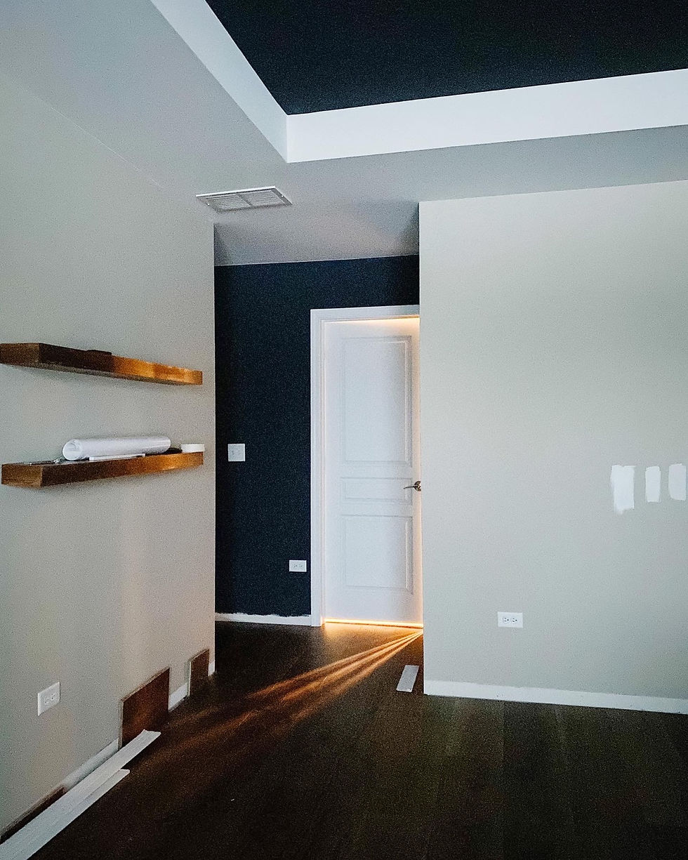
This year, fully committed to updating each space in our home, I turned my focus to our bedroom once again. We were in the middle of updating the flooring on our second floor and our bedroom had just had the new wide plank engineered hardwood installed. That kickstarted the room overhaul. We have a tray ceiling in there that was begging for some definition and interest. What better way than to paint it a bold color. Currently obsessed with the contrast between black and white, I decided the ceiling would be Wrought Iron by Benjamin Moore and the walls Silver Satin - complete opposites in name and in color but work together like a dream. In addition to the ceiling, our bedroom has a little nook of an entryway which I also used Wrought Iron to define.


My vision was coming to life. I often referred back to an inspiration picture from Studio Mcgee - aspiring to achieve that same feeling in my own bedroom. Light and airy yet warm and interesting - encouraging your eyes to travel from one curated corner to another. I created this moodboard so I could always refer back to my original plan.
I wanted to add more interest to the walls without overpowering the room with color and decided on picture frame molding on all walls except the one with the TV. I installed the picture frame molding "backwards" with the tapered edge of the molding towards the exterior of each box. I debated changing it to the more traditional orientation after nailing one box on the wall but resisted the urge and finished the whole room with this unconventional look and I'm glad I did. Once it was all installed consistently throughout the room, it looked seamless and beautiful just the same. Adding picture frame molding is the perfect way to add elegance to a space without being stuffy. Painting it the same color as the wall adds character to large blank walls without attracting all the attention.


The molding pattern for the wall behind the bed took some time to figure out. Because of the square footage of our room, our night stands and bed are stacked close to the window wall leaving enough room at the other end of the room for a couch. Having a couch in the bedroom has always been a goal because I want a space to sit and chat with my husband at the end of the day. It also provides a spot to sit and work on our laptops. It's also nice to have a way to watch TV in our room without being forced to watch from the bed. In other words, I wanted to leave room for a couch and if I centered the bed in the room, I'd have a lot of dead space all along the perimeter of the room. So for the picture frame molding on that back wall, I was trying to create a layout that was centered with the room but also had a box centered with where the bed was going to be. That resulted in a pattern that had too many boxes too close to each other and would make everyone dizzy. I then had to commit to this furniture setup and create rectangles highlighting each nightstand and larger rectangles for the bed and couch area.


After the floors, ceiling and walls were done, I focused on adding decor in slowly. Throughout the room I used gold accents balanced by wood or more muted elements - brass curtain rods with velvet curtains, brass light fixture with linen shades, shiny wall sconces over the nightstands balanced by an earthy urn with delicate white stems. It's this balance that makes a room really shine and provides that cause for intrigue when you least expect it.
What is your favorite part of this room makeover?


- neetlydone
- May 12, 2021
- 5 min read
How to create a vintage gallery wall

At some point last year, I decided that our awkward wall leading up to the stairway to our second floor needed a boost. In general, I've struggled with how to create an elevated and cohesive look in our living room while also tying it to the rest of our main floor. But I was determined to try something and decided that I would start with this odd shaped wall. I ordered some peel-and-stick wallpaper samples but none of the ones I got really went with the rest of the decor in the living room. A little nervous about the change, I decided to do a low cost update and stencil the wall instead. The idea was a good one, the execution was less than desirable. That's how DIY goes sometimes, you try, it may not work out, you learn, you move on.

I loved the idea of a stenciled wall but the colors and the pattern overpowered the room. It would have been a good choice for an accent wall in a bedroom but in my open concept main floor it stole the show, and not in a good way.
but in my open concept main floor it stole the show, and not in a good way.
Fast forward 8 months later and here I am again determined to update our living space and take it to the next level - for real this time. We already bought some new furniture, pieces that are the right scale for the space. For years, we've used furniture that we bought a long time ago but none of the dimensions or colors really work in our current home. With everything backordered, the couches are now scheduled to arrive in June leaving me just a few more weeks to get the space ready.
I ripped off the band-aid and painted over the stencil wall with primer. It's best to start with a blank canvas and not let the results of past projects cloud the decision making. Once the stenciled wall was no more, I felt calm. It was the right call and I was glad I made it. But where was I going from here?

Earlier this year, for my parents' 50th wedding anniversary, my mom scanned all our old family photos. Several of those were black and white from two generations ago and I remember looking through those albums as a kid and wondering who the people in the photos were and imagining what their lives must have been like. One picture showed my grandfather in a suit, drinking tea at his company event in the 50's. Another photo where my mom and her cousins posed with their newly coiffed up-dos before attending a wedding. These pictures are amazing to look at and I wanted to feature them in my home.
This led to my decision to create a vintage gallery wall on my little awkward wall. I created a mood board to test out my vision and the plan seemed like a good one. It was also the perfect location for the new modern console table that had already been delivered from our Arhaus purchase. It would be the perfect blend of vintage and modern with a touch of ethnic - the theme that can be seen throughout my home.

The gallery wall needed a crisp white backdrop and so I encountered my first stumbling block. I had already painted a couple of rooms white and had Benjamin Moore's Simply White, Swiss Coffee and Silver Satin left over. I painted little sections of each of these but none of them seemed right. Simply White a little too bright, Swiss Coffee a little too dull and Silver Satin a little too muddy. Each of these colors are phenomenal in the spaces I painted them in but here in the living room, against the white of the wainscoting they didn't seem right. I then ordered four samples - Super White, Distant Gray, Chantilly Lace and Decorator's White. After little deliberation I ordered a gallon of Distant Gray. It did not clash with the existing white trim and did not seem cool at all on the stairway wall that basks in direct south-eastern sunlight

Satisfied with the paint color, the next step was to create this dreamy vintage gallery wall. Many of the influencers I follow on Instagram use their amazing thrifted finds in their decor and because I was going for that old and vintage look I went to my local Goodwill to see what frames I could find. I came home with at least 17 of them and had spent under $30. Why was I not trying to thrift everything!? On my hunt for frames, I also found a great lamp which I made over to look vintage and would be perfect for styling my console table while illuminating this little area. In addition to the thrifted frames, I also added a few new ones with intricate details that I found at the Michaels Store.

That is what it's all about - creating moments in your home that are beautiful, awe inspiring and thought provoking.
Getting the layout of a gallery wall right can be tricky and it took me a couple of tries. Once I printed all the pictures and put them in their respective frames, I decided to create the layout directly on the wall. Our doorbell and thermostat are on this wall and I treated them as part of the gallery wall layout. Doing this layout without planning was not terrible but it was not great either. Some areas were perfect while the spacing in other spots were less than desirable. I had to do it over. I used a mix of nails and 3M picture hanging strips and taking all the frames down and starting again meant patching a few nail holes. C'est la vie. I already lived with a stencil wall I didn't love, I wasn't about to settle for a non-optimal gallery wall layout.

I needed to step away from this project for a day but when I resumed, I was determined to get this right. I laid all the frames on brown paper (I had a roll of paper from the paint store for protecting floors) and cutout rectangles to match the shape of each frame. I then used painter's tape to fix them to the wall and manipulated the layout until I was happy with it. I should have done this the first time around. Once I knew where each frame was going to go, I started replacing the brown paper rectangle with the real deal again using a mix of nails or 3M picture hanging strips depending on the type of frame. The end result makes my heart happy. I worked around the lamp and vase on the console ensuring they did not cover any pictures and treated the doorbell and thermostat as elements of the gallery wall. The final look feels put together and well thought out and just works.


Now whenever anyone walks by this wall, they pause, they look at the photos and take it all in and it's piqued my kids' curiosity about the generations before them. That is what it's all about - creating moments in your home that are beautiful, awe inspiring and thought provoking.

The next phase of the living room will build on elements prevalent in this vignette - a little classic, a little modern and a whole lot of pretty!
